Thursday, September 15, 2011

3 or more types of IDEAS (WEB DESIGN 1)

Searching for some examples to get the idea to work further, I don't know...maybe these are the ideas I might have?


Sometimes I really interest about this kind of topic, it's really feel some sense of humor inside. This might help for the 'HOW TO...' project. 


Colourful Typefaces bring out a lot of memories and fun sometimes. If the project includes these elements, it might helps, too. 


Not only focusing on 'How to...', might as well to look for some THINGS that needed to understand first before process to another stage of work, the background history as they said. 


This idea is just crazy. So many things we might involved in it too! Haha!


Errr...is this all? I don't know, either...I'm confused...maybe these will do. heh~  

Wednesday, September 14, 2011

4 Types of Photoshop/Illustrator Tutorial (WEB DESIGN 1)

Afraid that your design skill drops down? No worries! The famous tutorial website called "Abduzeedo", provides you many tutorials to improve your skills. I found 4 types which I think is suitable for us to train and learn well:


As a designer, inspirations and influences are important. Without them, do you think your artwork can be improved and stand out with others? The competition and opportunities are raising, we better make a move and learn more while we still in school of design.

4 types of Beautiful Websites with Analysis (WEB DESIGN 1)

Every websites we've been through, you may think it's nice, beautiful, sucks, crap and much much more than that. But if you look up into the REAL DESIGNERS websites design portfolio work, the inspirations will get you on creating an idea out from your mind. Here's what I found these 4 types:
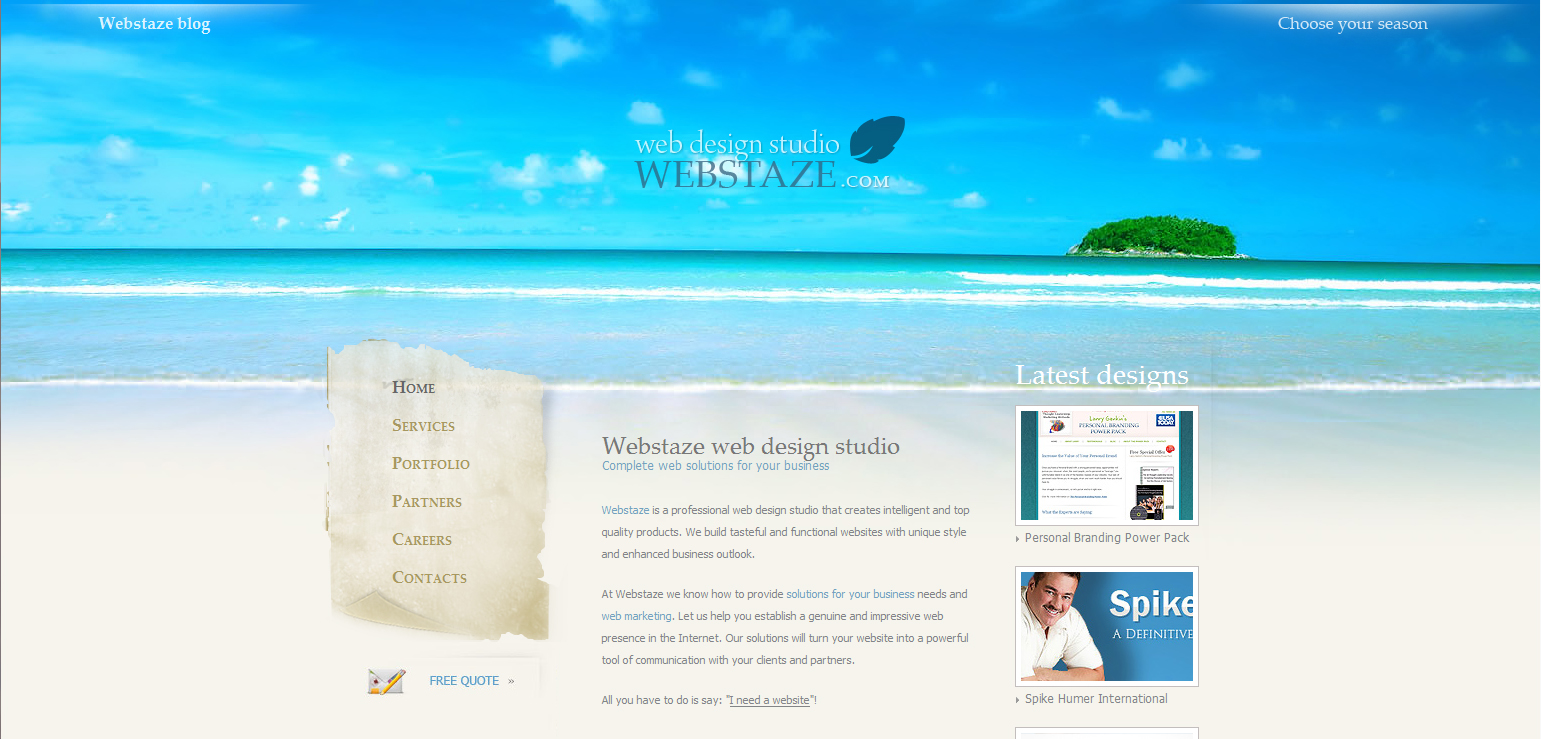


Webstaze 

People nowadays love to blog for their lifestyles at any time, anywhere. I pick this because I like the sea view, it gives a lot of pleasure and relaxation. Arrangement and typo wise are average, it's readable and simple. Not only that, you can pick your favorite season to suit your blog page. For me of course I would choose the sea view. Why do we need to have such complex blogging websites? Nobody will look much, but more to the reading entries, simple is beautiful, that's how i always recall to my friends. HEH!


N.Design Studio | Design Blog & Portfolio

A well-blessing chinese culture is filled in this page, also the illustration work is very creative and the mood is like I'm in a small chinatown. Overall it's a perfect match.


VIGET INSPIRE

Again, a blog page. Cooperate with the water color painting as a background makes feel like I'm writing my blog page on a water color paper. Besides, i can 'paint' in it to express my feelings as an entry diary. Typo can be better. The space below is a bit large, might as well to reduce some for extra spaces to view the entries. Nice.


Blogul Agentiei Web - Blue Engineering 

Galaxy is a fantasy world that we can only imagine its beauty. I love Galaxy view, in design of course, there's no way in real life, 'cause you won't survive that. Cartoonish characters make fun for the page, and the arrangement of typography is quite nice. Love the page, nothing wrong, though. Maybe...the layout can add something special, or perhaps no...


Not sure if the analysis is correct done, but this is what I should say about based on my point view. Anyway, will keep on looking up for more beautiful websites and some idea for my work. TaDa

Tuesday, August 9, 2011

Design Method Final Project - The Solution (BIG IDEA)

Hi guys, this is my final project artwork. We're require to use the BIG IDEA to produce like an advertising. Using simple, unique and easy understand BIG IDEA, to present to the audience, and bring out the message, too.

And yes, a survey is required to make for this artwork, because it includes marks in the project overall marks.
So please help out, this is the final, last project for the current semester.

Thank You.


(Click the video to go to YouTube for bigger screen watching, 
it's much better if you see it there.)

BIG IDEA: ONE MORE DROP, ONE MORE POSSIBILITY
STYLE: Some prototype WEB INTERFACE
SUBJECT: DESIGN METHOD 1 (Yr2 Sem 1 - May to Aug 2011)

Remember, BIG IDEA doesn't mean you need to complicate, but a simple, unique and strong message to deliver. You don't have to judge the art style, and I only want you to try to understand what brings to you from this BIG IDEA message. 

Questions (After you watched the video):

1) What can you understand about this BIG IDEA?

2) What is the MAIN big idea title that I need to tell the audiences?
(TIPS: The two sentences that show around before the video end...the life lines with words...)

3) Besides to present like interface, what other media can we use to deliver this important message to the audiences? Why?

4) In the middle part, there's some prototype game interaction, it's around 3 types in there. Do you have any other interaction besides these 3 above? Just give ONE example, to show every drop is precious and important.

5) Do you donate blood, too? When was it? Share your experience with me. 

6) If this BIG IDEA advertisement broadcast in all over place, whatever it's city center of KL or put them in the shopping mall with big screen or whatever, do you think people will get attention?
-YES
-NO. Why?

7)Last question, even you have donate blood before, will you donate again as if there's still more people need our help? 


THANK YOU! =) 

Wednesday, June 29, 2011

Survey of Design Method 1 Project

(Click to enlarge the picture)

The artwork above is is Project called 'Beautiful Information',
known as Infographics.
Just answer them in a quick, and proper way will do, and i thank you for your surveying.
Here's the questions:

1) Can you understand the information which provides from the infographics?
    A) Yes.
    B) No. (What are the things you don't understand about?)

2) Based the information above, have you met any one of those situation before?
    A) Yes. (State ONE cause from the picture above.)
    B) No.

3) Give comments about the artwork above. (E.g: Colors, arrangements, fonts, graphics...)

4) From the infographics above, besides those infos, what other causes besides those I've mentioned above?

5) Rate this infographic artwork. (Eg. ?/10)

6) Last, will you follow my instructions to prevent the situation after reading the infographic above?

THANK YOU!
=)

Friday, March 4, 2011

[PROJECT] Mobile Icon Package Design - USER TEST REPORT [HIGH IMPORTANCE]

Dear friends and visitors,

The following given down is a simple survey for my project work, it's called MOBILE ICON PACKAGE. You are advised to give an appropriate answers in each question given to you. Due to the work for school,  using any IMPROPER LANGUAGEs in this survey report is STRICTLY PROHIBITED, because this will be checked by my official lecturer, and will also take it as a serious work in order to give a final conclusion in my current subject. Do please help me to answer them, and take your time. I very THANK YOU, to cooperate the hard work with me! Here goes the Q&A now...

Note:
If you can't see them clearly, you can click the image and view into original size, or you can also download it by your own way, and view it, then answer them all. 

Please write your nickname or original name, just make it as long as I can remember who commented this page, and please DO NOT PUT "ANONYMOUS" as name!!

THANK YOU FOR YOUR COOPERATION! 0(^_^)o

Sunday, February 20, 2011

ICONs' Style

Another reference and research on how they execute their ICONs design in such creative and innovative.

Let's take a look:


That's all, folks! ^^